Showing posts with label interior design. Show all posts

Wednesday, June 6, 2012

Color Inspiration--Fresh Squeezed ORANGE

As with each new season, the arrival of Summer gives us all the chance to add something new to our interiors. I really like the use of bold color and with ORANGE being my favorite, I just had to share this awesome room inspiration.


Some people would be nervous about using orange in a room, but remember that you don't have to paint the walls orange (although I did in my dining room). Why not use it as a quick pick-me-up for your room by introducing it in throw pillows or painted side tables, such as in this room. How refreshing is this room? Just as refreshing as a glass of orange juice. Go, decorate and be BOLD!


Pin It

Wednesday, December 14, 2011

interiors Magazine


While searching the candy isle yesterday for holiday M&M's, I discovered a new magazine to LOVE! Check it out here. You'll thank me later, I guarentee it! Pin It

Wednesday, November 9, 2011

Office Design Sneak Peak

Decorating a commerical space is much more difficult than a residential space, let me be the first to admit this cold hard fact! While I have absolutely had fun with this project, it has certainly had several moments of challenges (one I'm still working out). However, I think the space is very professional and sleek. Here's a little sneak peak of the conference room, which I might add has changed just a bit with a few accessories since I first photographed it--more on the complete space soon.
Pin It

Monday, August 22, 2011

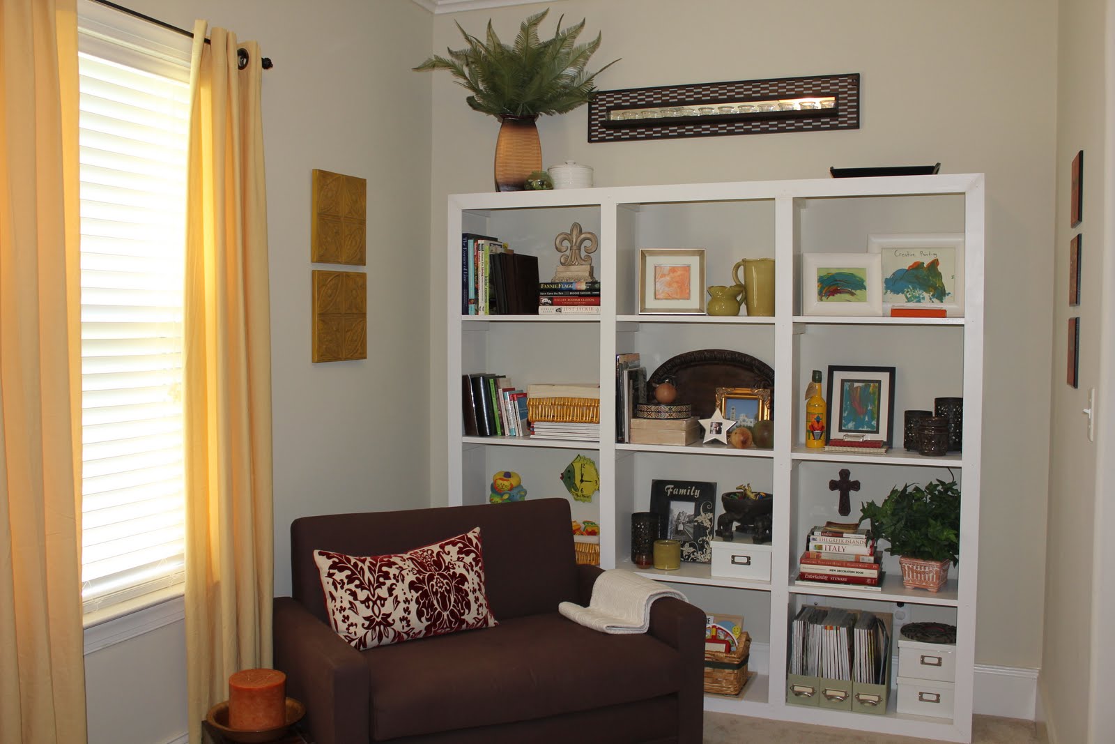
Homemade Bookcase

Have I told you how talented my husband is? Well, if not, let me brag and say--he ROCKS! When we first got married we used to watch Bob Villa's "This Old House" and laugh at how Riley, Bob's assistant, was the real "brains" behind the show. Bob would have all these great ideas and projects and Riley would make them all happen.

Over the years, I started calling Ray my "Riley". I would have an idea on something I wanted to do, some way to set up a room, or something I wanted to make and Ray would be the brains that helped me figure out how to make it happen. This AWESOME homemade bookcase is no exception!
I've struggled with our sitting room since we moved into our house 4 years ago. This was an added feature to our floor plan and it really is a nice bonus space. My struggle has been how to best utilize the space for our lifestyle. It's been a storage/staging area, a make-shift nursery, a temporary office--you name it. Well, I was kinda tired of it not being a designated space so when I took my Design 101 class, I used this space as my project space.
I browsed magazines and websites for photos of what I wanted for the space. One idea that stuck with me was sorta a library space that would utilize one side as a place to relax with a book and the other side as a work-space for blogging, crafting, etc. I knew I would need a large bookcase to eat-up some of the wall space and provide some much needed display for "stuff"! I gave Ray some "go-by" photos and presto, here's the end result. I really LOVE this bookcase and the wonderful brains of my "Riley" which made it happen!!
Pin It

Monday, June 20, 2011

Bathroom LOVE


The bathroom is the place you can really have FUN with color combinations. Although most say this is the room to tone down the color, I tend to lean the opposite. I like a vibrant color to give you that ZEST to start off your day (yes, my bathroom is a bright shade of YELLOW). But, even if you opt for a relazing shade, play up the accessories in your bathroom for some fun. Check out these color combinations and ideas and incorporate some of these into your next bathroom remodel--you'll be so glad you did!
Pin It

Wednesday, June 15, 2011

Kitchen Love

Not a lot of words today, just beautiful kitchen photographs. Enjoy!
Pin It

Wednesday, April 20, 2011

Design Inspiration

I'm in a mood to redo every room in the house! Relax, I'm not about to attempt that but I am contemplating some painting, rearranging and organizing. I recently read an article on classic American interiors that had some inspiring ideas for rooms based influential styles seen in cities across the United States. It's hard for me to choose just one because there are several of them I really like--which one, or one's, inspire you? The Los Angeles Look Here you have a mid-century modern look with the use of sleek furniture, hardwoods and breezy floor-to-ceiling curtains. I'm not usually a mid-century modern design type of girl but I would LOVE this room in my house (minus the gold accents, of course!).
The Chicago Look This room has a neutral wall color which allows the trim work to really pop. The large space is defined with an area rug and the upholstered furniture finishes it off. I would add a little more "spice" to this room with some more red (see a hint of it hiding in the back corner) but this room looks very comfortable and inviting. The Key West Look Now we're talking! Load this room on the truck and deliver it to me, please!! The use of white with the bright lime accent speaks to me. You could use other colors, like turquoise or yellow, with or without the lime green. This room is relaxing and perfect! The Santa Fe Look This style always grabs me and pulls me in. I love Southwestern architecture and the use of warm colors and stone floors! Adding the rich browns with the use of leather and wood help pull this style together--fabulous!
Pin It

Thursday, March 10, 2011

Spring: Hues of Pink

I must admit that I am a bit on the fence when it comes to pink. The thing I really do like about shades of pink is how from one hue, pink can be soft and relaxing and in another hue it can become bold and energizing. While that's true with many colors, pink just seems to have some quality the other colors don't have--I haven't quiet put my finger on it but I think it's because I've been ignoring pink for way too long. Why, you ask, would I ignore pink? I think the thing that bothers me, personally, about pink is that it tends to be a bit overused. Because it feel into my overused category, I've steered clear of pink in most of my color choices. I have a tendency to lean more toward colors rarely thought of--the unexpected. However, recently I've seen some designs that are making me rethink my pink--check these out:
photo courtesy designer Sarah Richardson
Sarah Richardson is one of my favorite designers. Her simplistic, yet unexpected uses of the color pink give a fresh, new look to this girl's bedroom. The bold, floral fabric is feminine but not too sweet--genius!
photo courtesy Rate My Space
The polka-dot pillow provided the inspiration ECinNC used to design the focal wall in her daughter's bedroom. The pairing of the pink polka-dots with the and apple green damask fabric is complementary while the white provides a grounding for all the pops of color. Fresh and bold!
photo courtesy designer Erinn Valencich
Using spring tulips and roses in the same shade of pink provide a hint of the change in season. And, the mirrored stacked tables are pretty de-lish too!!!
photo courtesy designer David Bromstad
I'M IN LOVE! Now, this space and all its pink have my heart fluttering! Designer David Bromstad, another of my favorites, brilliantly harmonized deep burgundy, yellow and touches of pink in this open floor plan space. LOVE, LOVE, LOVE!!! So, with my new appreciation for pink and its many hues, I think I may incorporate it into a space this spring. Bring on the pink!!
Pin It

Wednesday, November 24, 2010

Knowledge Is a Good Thing

Last Thursday was our final Interior Design 101 session. We discussed window treatments and fabric and looked at some hot trends from the High Point Furniture Market--GOOD STUFF! I am so glad that I took this class. Not only did I get to meet several "designer wannabes" like myself, I really feel like I learned a lot about design. There is a follow-up series in the spring and I definitely plan to sign up so I can increase my design knowledge. So, since so many of you LOVE design too, I thought I'd share some of my new found knowledge: 1. The Color Wheel is a visual representation of colors arranged according to their chromatic relationship--the primary hues are equidistant from one another and are bridged using secondary and tertiary colors. A. Primary Colors--those colors at their basic essence which cannot be created by mixing others. B. Secondary Colors--those colors achieved by a mixture of two primaries. C. Tertiary Colors--those colors achieved by a mixture of primary and secondary hues. D. Complementary Colors--those colors located opposite each other on the color wheel. E. Analogous Colors--those colors located close together on the color wheel. Did you know there was a Color Council? I didn't but what a GREAT council to serve on--where do I sign up? Apparently, this council gets to pick colors every two years which comprise the market colors found in paint decks! 2. A few design rules of note: (a) all the lampshades in a room should be the same color; and (b) you should never use furniture in a room that has all legs showing--you should mix it up with some skirted pieces EXCEPT if your style is Transitional or if you have a period room, such as Victorian. 3. If you are having furniture reupholstered, you should always label the face side of your fabric. Some fabrics are pretty on both sides and it can be difficult to determine which is the front and which is the back. Mark it clearly so the upholsterer does not make a costly mistake! 4. All lining on your window treatments should be the same, especially those window treatments on the front of your home. This is important because from the street, passers-by can only see the lining and you want them to match. This rule becomes bendable when you have blinds or plantation shutters. 5. A piece of upholstered furniture, such as a sofa, which is 8-Way Hand Tied is of exceptional quality. If you can find this type of construction, buy it and it will last a very long time! 6. Space Planning is key to good design. One should always measure their space before purchasing key pieces for a room to avoid costly mistakes. Obtain your field measurements by measuring the length and width of your space (LxW). Include the molding as part of your wall measurement. Take these measurements with you when you're shopping for furniture and window treatments (I also bring along a tap measure)! Pin It

Wednesday, November 10, 2010

Thou Shalt....

I had to share these "musings" with you courtesy of Jonathan Adler! While I agree (and love) them all, #8 is my favorite!! If you haven't checked out Jonathan Adler lately, you should (he ROCKS). Enjoy!
Our 10 Commandments for a Happy Chic home 1. Thou shalt embrace maximalism. Thou wilt find minimalism to be something of a bummer in thy abode. Thou wilt grow tired of an endless sea of beige and thou wilt long for a splash of color & a dollop of pattern! Bargello pillows, Furnace bottles, and rustic modern lamps - these shalt be the accessories that add some panache to your pad. 2. Thou shalt not deny thyself hotelish comfort at home. Thou shalt furnish thy rooms with paw-pampering, hand-loomed llama wool rugs, luxurious lighting and our fabulous furniture. Thy rooms shalt feel like the most opulent hotel rooms in which thou hast ever stayed. Thou art worth it. 3. Thou shalt buy an X-Bench. Then, thou shalt buy another. Thou shalt use them in pairs, perfect under thy console or placed near thy sofa. Thou shalt rest thy feet upon them & so will thy guests. In fact, thy guests might even fight over who gets to rest upon them. Therefore, thou shalt establish house rules about thy X-Benches. Perhaps thou should consider a sign up sheet. 4. If thy nest needeth zest, consider thy crest! Thou shalt emblazon with thine initials wherever possible. 5. Thou shalt mix fancy with frisky. Thou shalt not be overly formal, for if thou art, thou will be sad. Conversely, thou shalt not be overly whimsical, for if thou art thou will not feel chic. Therefore, thou shalt embrace a mix, pairing the chic classical foundation - excellent proportions, classic furniture - with a layer of playful punctuation. Then thou shalt rest. 6. Thou shalt honor the funsters of yore. David Hicks, Alexander Girard, Piero Fornasetti, Bonnie Cashin, Bjorn Wiinblad - if thou dost not knoweth them, thou should. Thou can use Google Images to learn more about them and thou shalt channel their fun, idiosyncratic, playful spirit in thine own interiors. Thy home will be fun, happy, and chic. 7. Thou shalt not commit murder, ...unless thou art murdering for a decorative accessory. If thou should find thyself at one of our stores and seeth the last bird bowl on our shelf, thou shalt feel free to use whatever means necessary to obtain that special something. 8. Thou shalt not be afraid of orange. Thou shalt use orange copiously in thy interior, whether it beeth in an orange breakfast room or via the zing of an orange lacquered box. Thou might even consider painting thy front door orange to pique thy neighbor's curiosity. Thou shalt also covet chocolate brown. 9. Thou shalt play ping pong. Better still, thou shalt have a ping pong table in thy living room. Then, lo, thou shalt play ping pong with thy spouse rather than sitting around watching thy tv. 10. Thou shalt not covet thy neighbor's house. In fact, after following these 10 commandments, thy neighbor might covet thy house. So there.
Pin It

Thursday, November 4, 2010

Sorta Like Grown Up Paper Dolls But Better

I realized that I haven't posted about my Interior Design 101 class in a while so I thought I'd catch you up. Tonight is the fourth meeting of our six class session. So far, we've studied space planning, design terms, colors and field drawing. Each student selected a room in their home as their "class project" and we had to draw that room to scale. Yes, that's my room of choice in the picture and it's our master bedroom/sitting room. This room has several "design" challenges so I'm excited to actually go through the space on paper and devise a space plan before the designing begins (pretty cool, huh?)! And, see those little pieces of paper? Those are the furniture cutouts we use to move everything around the room to achieve the designed space--trust me, this method is much easier on the back! Cutting all these little pieces out reminded me of playing paper dolls when I was a little girl. Funny thing, I think I had way more fun than I remember with the paper dolls (yes, I'm a dork, I know)! I am really excited about tonight's class to hear everyone's design ideas for the space. Two (or in this case twelve) heads are better than one! Pin It

Friday, October 22, 2010

Show Us Your Life Post--The Nursery

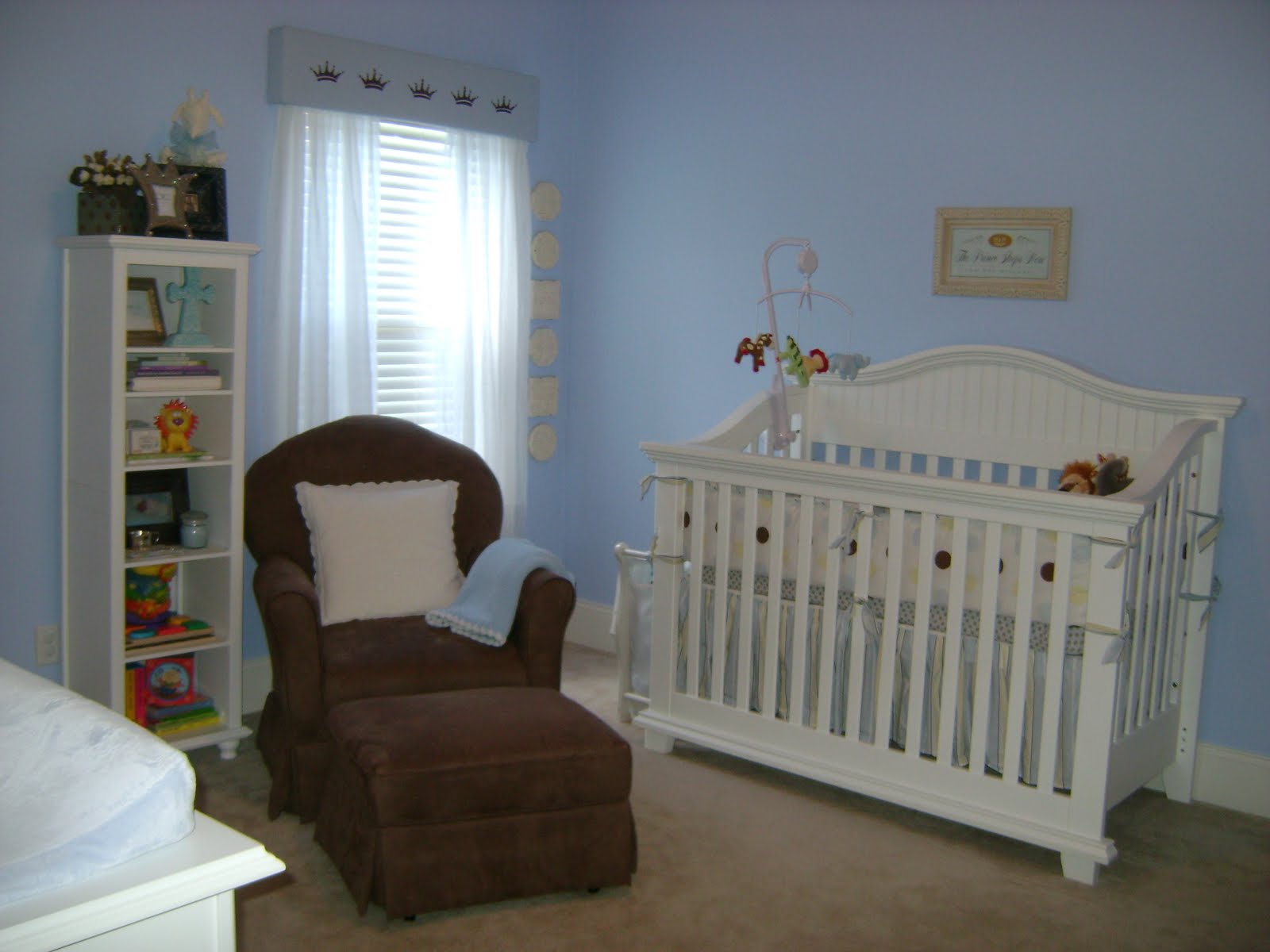
One of my favorite blogs is Kelly's Korner and you should definitely pay a visit to her blog here. She is the cutest mom with the most adorable little girl, Harper. Her post for today is "Show Us Your Life Nurseries and Kids Rooms" and I loved looking at some of the most adorable rooms ever! Since we are pretty close to growing out of a nursery and having a big boy room and playroom, I wanted to post about our nursery before it is no more! Since he was first, I'll start with sweet Jackson. He was born in March 2007 and at that time, we were living in apartment awaiting the completion of our house. We moved in when he was ten days old and the nursery was first on our list to set-up.
The color scheme I used was light yellow, light blue and chocolate. I decided on those colors after finding bedding I loved at a local boutique, Heir Apparent. To add some visual interest, I had two opposite walls painted with stripes and left the other two walls light yellow. The painter was awesome--he did the stripes freehand in half a day! The furniture came from a really cute store in Tuscaloosa. The crib is convertible which at the time, I thought was a must (oh, the things you learn on your own). I like that we have the option to convert it but when Macklin came along, we decided to move Jackson into a "big boy bed" and keep the crib just as it is--it was a good decision for us. This dresser was in my room when I was a little girl and it has lots of storage. We didn't really have a space for it in the new house so we opted to move it to the nursery for organizing all the new baby items we were trying to figure out! This is the sign that hung on our room door at the hospital. A dear friend of mine's dad made it for me and I love it! I painted it and added the ribbon from my baby shower gifts to it so I could hang it. It is very special to me and I will keep it forever! Macklin's nursery is similar but different in subtle ways. Since we had a toddler on our hands, we were worried about the transition and a new baby. We made a big deal out of Jackson becoming the big brother and him growing into big boy room. With that in mind, I didn't want the new baby to look back and pictures and think he just got his big brother's leftovers so I tried to change things up a bit through accessories and color. The nursery got a fresh coat of light blue paint on all four walls. It is a very calm and serene color that relaxes you the moment you enter the room. I opted to use the same bedding for Macklin but bought several new crib sheets for a subtle change. I made the cornice and covered it with a light blue fabric so it would blend in with the walls. To add interest, I hand-painted the crowns in chocolate brown. The white tiles are from Southern Living at Home and I had so many of them, I decided to add them here for some texture. I added some new artwork and a corner armorie we used in the living room at our old house. We painted it white and removed the bottom doors so we'd have some open storage. My old dresser moved next to the armorie and we moved the changing table to wall opposite the crib. We bought new Boppy pillow covers and I used one as a "C" (for our last name) on the floor next to the changing table. This nursery has been great and we will be sad to see it go now that Macklin is 18 months old and ready for the next step!
Pin It

Thursday, October 7, 2010

Homework

One of our weekly assignments in my design class was to gather pictures from magazines of rooms we like so we could discover our design style. I keep a folder on my laptop of house ideas so this was a simple task for me. I just picked a few I really like and printed them out. Because I wanted to search for new inspiration, I took to the Internet for some more pictures to add to my file. I think I know what my design style is but I can't wait to see what our instructor tells me. Below are a few images of rooms I LOVE--can you see my design style?
Pin It

Friday, October 1, 2010

Interior Design 101

Last night I attended the first session of my interior design class and it did not disappoint! There was a room full of eager folks, ranging in age from 20-50, and everyone was ready to learn about design. After introductions, a bit of industry small talk and some job market discussion, we got into space planning. Our first exercise was a review of a residential floor plan. The particular floor plan our instructor choose was one in which the clients faced several design issues once the home was complete. Everyone eagerly scoured the plan attempting to find the problems. Secondly, we went over architecture drawings, measuring to scale and how to measure a space correctly. This discussion brought us to our very first assignment which is a three-part one: (1) get a Benjamin Moore paint deck--check; (2) compile 20 to 30 pictures from magazines of design ideas and rooms we like--check; and (3) select a room in our home as our class project and then measure and draw that room using an architect scale. Sketches, renderings, architectural drawings and blueprints are like candy to me--I love them all! To say that I am oozing with excitement about measuring and correctly drawing a room in our house is more than an understatement! One of the things I like most about design is seeing the designers drawing actually "come to life" once the space is complete. I am making a trip to the store this afternoon for my architect scale so I can get to work! Pin It

Friday, September 10, 2010

Recent Redos

One of my many strange tendencies is to rearrange the rooms in our home. I just can't seem to put something in a place and leave it there. Even though my madness lead to bodily hard for Ray several years ago, I cannot seem to kick the habit to move things! Bodily harm you ask, yes, bodily harm. Several years ago, I rearranged our living room after Ray went to bed one evening and when he got up early the next morning to let our dog out he broke his toe on our ottoman! Recently, we started entertaining the idea of selling our house. It's a great house, just not a great house for us. It's very spacious, has an open floor plan and sits on a great lot with an long driveway in a nice neighborhood. We have plenty of space to grow should we decide to expand our family but we think we'd be happier in a smaller, more comfy house.With these thoughts in mind, I've amped up my desire to get all the rooms finished and decorated for Fall. Now I not only face the challenge of incorporating kid-friendly design but must keep in mind that a "staged" house presents itself much better in the marketplace. Here's what I've accomplished so far: This is the small wall behind our front door as you enter our foyer. I placed a dainty table which I recently purchased at Chelsea Antique Mall. I wanted to use something in this space that wasn't overpowering but allowed for some small accent pieces.... This is the other small wall in our foyer. We used this cabinet in our previous house but I gave it a mini face-lift and added the dark brown accents. I wanted to have a mirror and lamp in this area for use in the evening and decided to keep the accents simple with my estate sale lamp which you may remember from here and some great frames I found at a few yard sales.... This is our dining room which is located just to the left of the foyer. This was one of the first rooms we painted when we moved in a few years ago. It's a fantastic shade of orange with turquoise and white accents and large, farmhouse style furniture for comfortable dining.... Our study is to the right of the foyer and has transom doors for privacy. You may recall this post which is the wall just to the left of these chairs. Currently, we are reevaluating the use of this space but this room is really comfortable and a great place to escape for some quiet time..... This is the entry hallway. I used this bookshelf from Pier One as a place to display lots of family photographs which can be easily removed before an open house.... This is the TV wall in our keeping room. The cabinet is from Z Gallery and was an excellent purchase--I wish I had another one. It neatly houses my collection of Martha Stewart magazines, design books, pottery and family photographs.... This is another view of our keeping room and it's where we spend the majority of our time. The curtains were my very first sewing project which you can read about here. I used the space underneath the couch table to organize all the boys books and toys in large baskets which provide easy access and clean-up.... This pie-safe serves as a room divider for the keeping room and eat-in kitchen area. We got this piece at Frontera and I must admit it is one of my favorite pieces of furniture. I have a set of pottery from my grandmother inside, a fore more design books and some serving pieces for entertaining.... This is a small wall in the back of our eat-in kitchen where I placed our wine table (minus the wine) and some cookbooks I use often.... And this is the space above largest wall of kitchen cabinets. It's hard to tell in this picture but the cabinets are designer cabinets with a glaze topcoat. I was the first to ever pick these cabinets at the design studio and everyone was anxious to see how they would look once installed. They are really neat and I am very happy with my choice. Hope you enjoyed the mini-tour. More decorating and space redos to come soon! Pin It